Introduction
Web pages can be viewed on various devices ranging from handheld smartphones to tabs, laptops, and desktops. Regardless of which, your web page should be easy to use and look presentable not missing out important information in order to fit on smaller devices but should be fluid to adapt its content to fit any device. In this series, we will take a deep dive into learning what responsive websites are and how to implement them on your new or existing project.
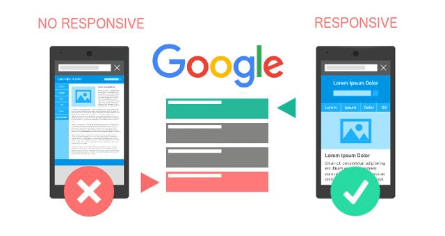
image source:theedgesearch.com/2019/11/mobile-first-seo-..
A responsive website is an approach to web development that makes web pages render well on a variety of devices and windows or screen sizes. The idea is to ensure you give the users a satisfying experience when accessing the web page across different devices notwithstanding the screen size and viewing environment.
Responsiveness relies upon the properties of the device, browser, and viewport. The device could be a tab, mobile, or desktop device and browsers could be safari, opera, firefox, chrome, etc.
=>The viewport is said to be the user's visible area of the webpage.
A responsive website should Have :
Readable text without requiring zoom
Adequate space for tap targets
- No horizontal scrolling
Importance of Responsiveness
It is necessary to make your web design responsive on all devices because it makes way for:
Search Engine Optimization:
Otherwise known as SEO is a strategy used by numerous companies to boost their position on a google search page rankings. Google gives visible preferences to websites that are mobile-friendly and this creates higher chances of meeting potential customers by ranking as top page search.
User experience
You want people to like your site, and you want it to be easy to use And to convince them to come back. If someone visits your website on a mobile device, and It’s doesn’t render properly displaying the needed information it would be difficult to come back to the page.
Approach to Responsive design
Prior to this time, there has been only one method which was practiced when building a web design “Desktop First” approach, and this used to be very helpful until the introduction of mobile devices. Even after the rise of mobile devices, there are plenty of situations in which this ‘think big’ method remains ideal and is still adopted. In today’s world, a lot of people are using handheld devices (tablets and smartphones) to browse the web and the statistics show that there is a great need to consider screen sizes when designing a website.
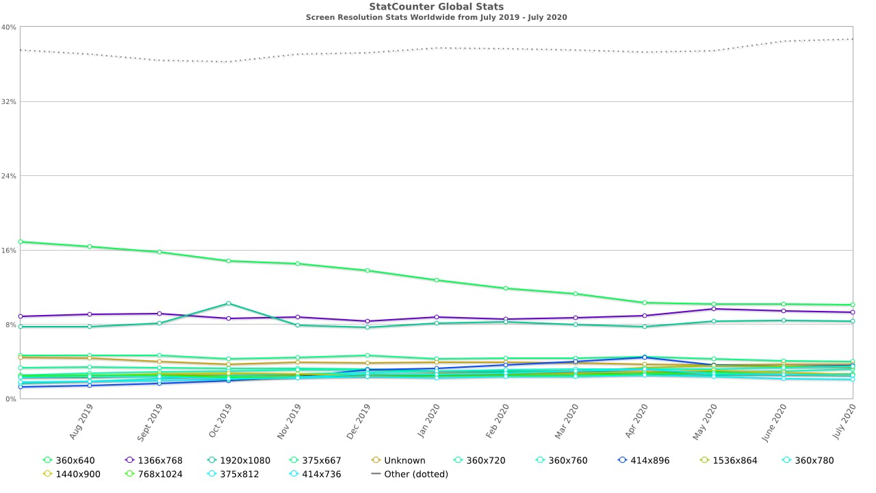 image source:gs.statcounter.com
360x640 => 10.11%
1366x768 => 9.3%
1920x1080 => 8.35%
375x667 => 3.98%
414x896 => 3.5%
360x780 => 3.45%
(Screen Resolution Statistics Worldwide)-July 2020
DESKTOP FIRST:
This is a design type where you build every feature for a large screen and permit for scaling down to as viewport becomes smaller(often called graceful degradation), means hiding and wrapping elements while trying to support as many original features as possible. This approach is mainly targeted for office use. This is because it offers access to major features all at once which is a greater advantage over the mobile-first, It is also supported by all browsers.
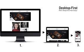 image source:converticacommerce.com/ux-ui-frontend-desig..
MOBILE FIRST:
In this design type, you consider using styles targeted at smaller viewports first as the default styles for the website before it adapts to larger screen size this doesn't make the desktop first less relevant but, It is best to have the mobile users in mind first because according to Google about 80% of search traffic on websites is done on mobile devices, the user is more likely to access the webpage on their mobile devices than a desktop. This is because there is a wider range of users who have access to smartphones and other mobile devices as to those who use desktops. qRM_tAe.png)
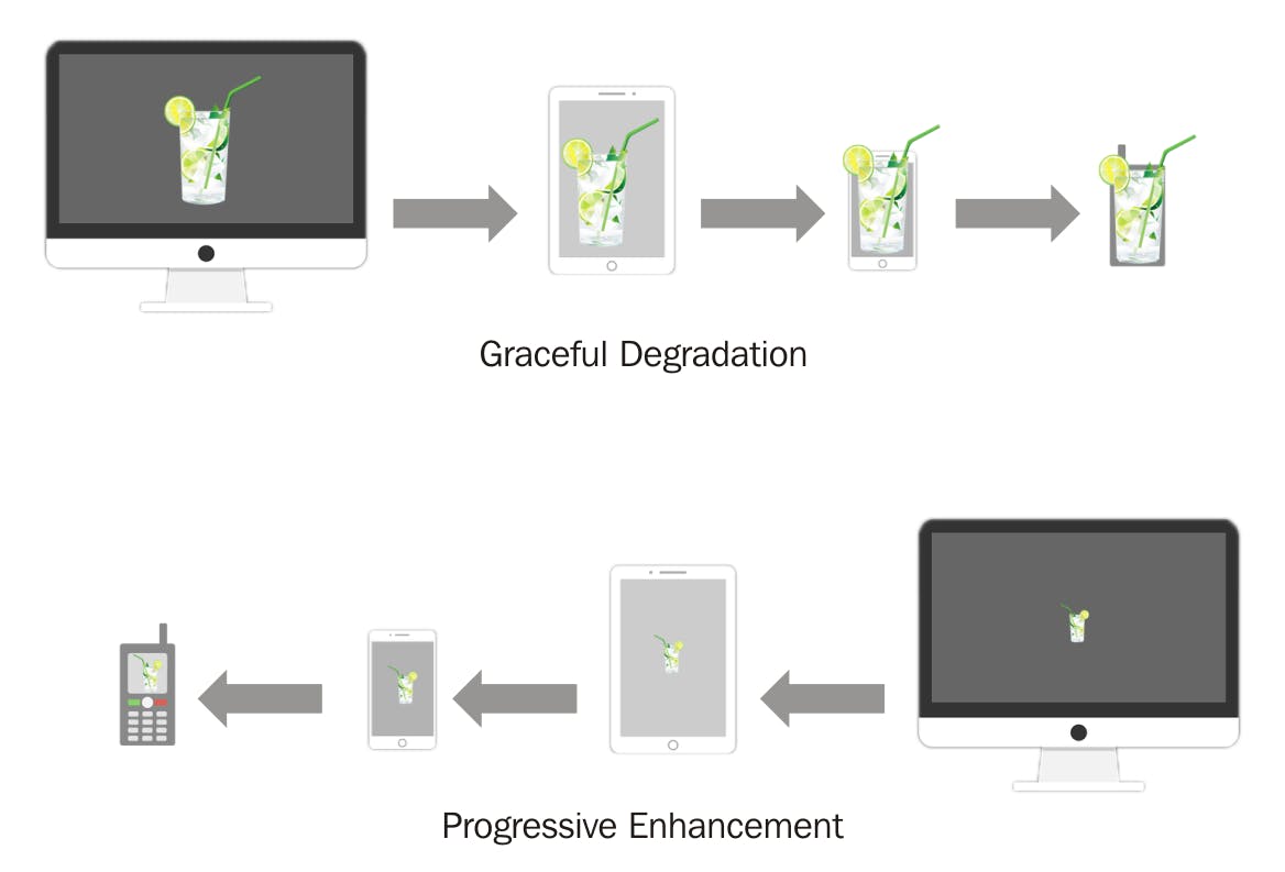 Image source: readyartwork.com/mobile-first-design/amp
Layouts to consider
Small: under 600px. Consider how content will look on most phones.
Medium: 600px – 900px. Consider how content will look on most tablets, some large phones, and small netbook-type computers.
Large: over 900px.consider how content will look on most personal computers
How to achieve responsively:
fluid Grid
-
conclusion
I am sure after going through this series we would be able to successfully create a responsive website.

