


Introduction
One of the ways to customize the presentation of your web page to a specific range of devices within certain capabilities is the use of Media queries.
Media Queries: These are blocks in CSS that are written according to the criteria of the device they match. The media query is essential in modifying your site in order to make it support a certain screen size and characteristics. They are like filters applied to CSS styles, they make it easier to change styles and adapt to the type of device rendering the content or the features of a particular device. These features include width, height, orientation, hover, and much more.
The basic syntax for media query takes 3 different formats which can be included. they look like this:
.main-container {
    font-size: 20px;
    flex-wrap: flex;
  }

 /*Syntax when using media queries in your CSS file*/

@media  (max-width: 700px) {
  .main-container {
    font-size: 13px;
    flex-wrap: wrap;
  }
}
- Media queries as part of HTML link element —
< link rel="stylesheet" href="my-style.css" media="screen and (media-features)" / >
Media queries based on viewport
Media queries allow us to create a responsive experience whereby specific styles are applied to small screens, large screens, and anywhere in between when testing for the screen size we look at :
orientation(portrait or landscape)
width(min-width, max-width)
height(min-width, max-height)
Logical operators
Device-width/device-height
ORIENTATION:
This parameter is used to determine the viewport is either a landscape or portrait.
Landscape: This viewport is usually seen on wider screens (desktops) and appears horizontally.
@media (orientation:landscape) {
     .main-container {
       padding: 30px
    }
  }
Portrait: This viewport is usually seen in mobile devices and it appears vertically.
@media (orientation:portrait) {
     .main-container {
       padding: 30px
  }
 }
HEIGHT:
This parameter checks on the height of the viewport which is rarely used since websites take a default vertical position except in cases of shorter viewports. You can either use either the min-height or the max-height.
WIDTH:
This the most frequently used parameter it checks for the width of the viewport which is normally expected to be fixed according to the viewport. You can either use the min-width: This is applied if the viewport is wider than the number of pixels max-width: This is applied when the viewport is narrower than the pixels. The browser usually checks the CSS media queries to apply these styles as required.
@media (max-width: 1000px) {
    .lesson {
     max-width: 100%;
     min-width: 100%;
    }
 }
NOTE: The max prefix indicates a value or equal to the given pixel. The min prefix indicates a value greater than or equal to a given pixel.
Logical operators:
They serve as powerful expressions in the Media Queries. There are about 3 major logical operators
- AND: This logical operator supports more than one condition to be activated.
 /* Eg. when using the logical operator AND */

@media (max-width:800px) and (orientation:landscape) {
     .main-container {
       padding: 30px
    }
 }
- Not: This logical operator says, work on any other queries except the one being identified.
  /* Eg. when using the logical operator  NOT*/
    @media not color (max-width: 800px) {
     aside {
      max-width: 100%;
    }
  }
- ONLY: This logical operator says apply only the query being identified.
/* Eg. when using the logical operator ONLY */
    @media only screen (max-width: 800px) {
     .main-container {
       padding: 30px 20px;
      }
   }
ALL: The all logical operator is set as a default to all media types when no other media type is specified.
  /* the ALL logical operator is written as */
 @media all and (max-width: 670px) {
    aside{
      width: 100%;
    }
 }
,(comma): This logical operator is used to combine media queries for multiple layouts of a design into a single line. Every query in a comma-separated list gets treated separately from the others.
These above queries aren’t necessarily used in your daily practice, but you can imagine how powerful and targeted this chaining can be when specified.
Device-width:
Device-width refers to the width of the rendering surface of the output, in other words, the screen resolution of the device. Device-width instructs the page to match the screen's width .
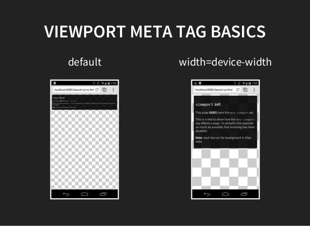 image source:slideshare.net/VladimirZhidal/responsive-we..
/* Mobile Phones Portrait  */
@media screen and (max-device-width: 480px) and (orientation: portrait){

}

/*  Mobile Phones Landscape  */
@media screen and (max-device-width: 640px) and (orientation: landscape){

}
Media queries based on device capabilities
Due to the wide range of devices available, we cannot assume that every device has the same abilities as the desktop or that every mobile device accessing the webpage is a touchscreen. The features such as hover, pointer, and any-pointer, should also be considered.
Hover:
This is a CSS media feature which is used to test whether a user's primary input mechanism can hover over an element. It is usually specified using keyword values of none or hover.
example using none example using hover
Pointer:
This is a CSS media feature that tests whether a user has a pointing device such as a mouse and how accurate the pointing device is. It is specified using the keyword values of
None: The input mechanism does not include a pointing device coarse: The input mechanism includes a pointing device of limited accuracy.
Fine: the input mechanism includes an accurate pointing device.
Any-pointer:
This media feature is used basically to test for the accuracy of any pointing device. example
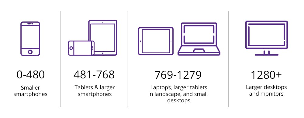
Image source: bitdegree.org/learn/responsive-media
Specific rules for media queries on Larger viewport
This rule is used for tablets and bigger viewport
@media  (min-width: 768px) {

}
This rule is used for laptops, small desktop screen, and bigger viewport
@media  (min-width: 992px) {

}
This rule is used for larger desktop screens only
  @media  (min-width: 1200px) {

   }
Specific rules for media Queries on Smaller viewport
This is the rule used for mobile-only
@media (max-width: 767px) {

 }
This rule is used for both mobile and tabs
 @media (max-width: 800px) {

 }
This is used for laptops, smaller desktops, and smaller viewports
@media  (max-width: 1000px) {

}
Conclusion
Media queries have been really useful in achieving responsiveness on webpages and the fact that it covers the diverse range of devices and still makes complexity in designs achievable is just like magic.