


Introduction
CSS has several options for which unit to use in determining the various css properties, this units have provided a new ways of achieving flexibility to texts in CSS. Getting familiar with all the options for css units can play a key role in achieving responsiveness in a webpage.
DEFINITION:
The css units are used in determining the size of a property you are attributing to an element or its content.Let's Say you are to set the property Padding to a button tag, you would assign a value to it and that value includes a unit.
Button{ padding: 5px 10px; }
The padding is the property.
The 5 and 10 are the values.
While the px is the unit used.
The there are two types 2 units
Absolute units
Relative units
Absolute units :
The absolute units are the fixed units which take the same size regardless of the parent element or the screen size. They do not change or resize no matter the device on which they are viewed. These units are best favorable for print layouts because the output medium is known. These units are not recommended for working on a responsive website because they do not scale to changes in screen size. Some of these units are :
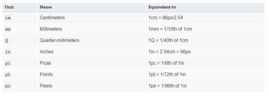
image source:medium.com/@seowjianliang/css-overview-bloc..
The pixels are the most used of the units until recently most developers still use the pixels in defining font size. Although these units serve best for website with fixed width ( print layouts ).
Relative units :
The relative units specify a length relative to another element or the viewport. They are useful for styling responsive sites because they scale relatively to the parent or window depending on the unit that is used. The relative units can be used as default for a responsive webpage in order to avoid update of styles as the screen size changes. Some of the very useful units are:
The em: This is a relative unit that acts best on font-size of an element.They are relative to their parent element as a result of inheritance. The font-size is an inherited property, so if you don't declare it anywhere, the element will take the default setting of 16px.
Example:
<div>
<ul>
      <li class=”.smaller”> list 1 </li>
      <li> list 1 </li>
      <li> list 1 </li>
</ul>
</div>
If you set the ul to a font size of 1.5em it automatically takes about 150% of the parent element assuming you set the div to a font-size of 18px, But if you set it to 1em , it will take up 100%of the parent element(18px)
 div{
   font-size:18px;
}

  ul{
      font-size: 1.5em;
    }
When using em the font size will always refer back to the root element and in this case the ul except you have to specify a change in the font size of the particular li by
.smaller{font-size: 0.5rem;}
It is not adviced to use the em as a general unit of length except for the particular element you want to scale as font size scales.
The Rem: this is similar to the em except that instead of varying on the current element it is relative to the font-size of the root element(HTML) . If you set a font-size to the root element(HTML) the rem will be on a consistent measure all through the page .The Rem is an abbreviation for Root em.
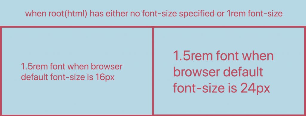
Image source: labs.tadigital.com/index.php/2020/06/18/com..
Example:
 Html{
  font-size:18px;
}


.header{
      font-size: 1.5rem;
    }
Look at some common font sizes used and how it it is expressed in rem units assuming 16px is base size
10px = 0.625rem
12px= 0.75rem
14px = 0.875rem
16px=1rem(base size)
18px= 1.25rem
20px = 1.25rem
24px =1.5rem
30px =1.875rem
32px = 2rem
The ex :this unit is just like the em but then instead of measuring relative width it measures the relative height of the letter( X) which is the lower case. It changes depending on the font family and font size .This unit is determined based i measure specified to each font Example :
p{
     line-height:2ex;
    }
This line of code will make the line height to double the height of the lower case(p)
The ch : This character is equal to the width of an element's current font(0). It measure the the width of the character “0”
The Vh: this unit means viewport height and it represents a percentage of the viewport height. The viewport is the area which is visible to the users on the webpage.
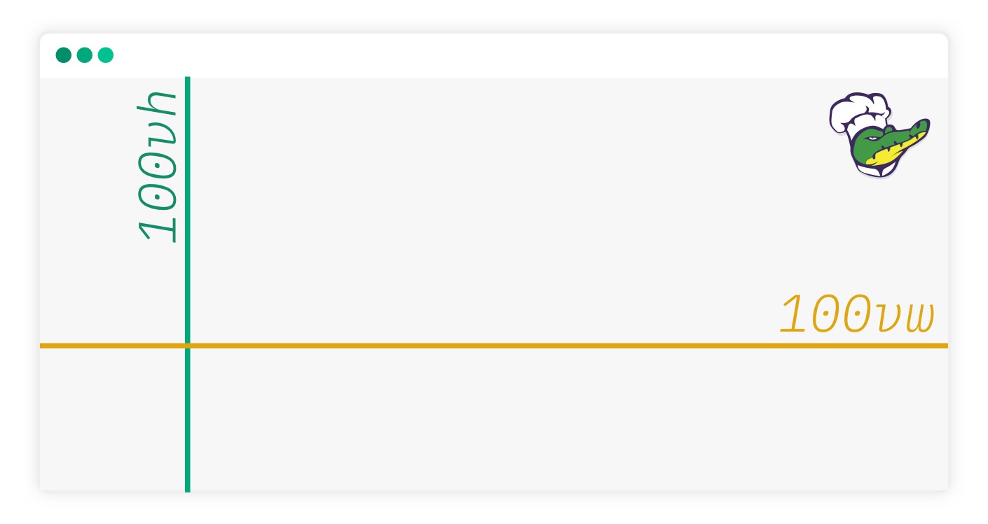
Image source: alligator.io/css/viewport-units
For instance, when you set an element with a vh of { height:50vh;}This means it will take up 50% of the browsers window height.
The Vw: This unit is relative to the width of the viewport. it represents a percentage of the viewport width. Example:
.main{ width: 50vh;}
this means that the it will take up 50% of the windows width.
Vmin: This unit means the viewport minimum unit .it represents the minimum between height or width with reference to percentages. It is relative to the viewport's smallest dimension with width or height. For instance 40vmin is equivalent to 40%of the min width or height.
 .aside{
      width: 40vmin;
  }
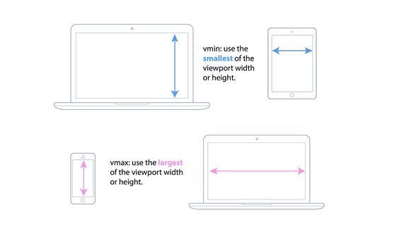
Image source:pinterest.com/pin/463730092865039412
Vmax: This is relative to the viewport's maximum unit between height or width in terms of percentage. It uses the ratio of the largest size between the height and width.They value of 50vmax is equivalent to 50% of the viewport's current width or height depending on which is larger. Example: .aside{ width: 50vmax; } The vmin/vmax can be an addition to the css orientation media queries (@media screen and {orientation: portrait;} or {orientation:landscape;})
Percentages: These units are relative to another value which they are enclosed in parent element. For instance , if you had a parent element with the value 500px and you gave the child element 50% it would take up 250px of the parent element. Example .
.container{
      width: 100%;
  }
  .main{

      width: 60%;
  }
  .aside{
      width: 40%;
  }
The Fr units: These units are known as fraction units; they are used mostly for CSS Grid to represent 1 part of an available space based on rows or columns.
CONCLUSION
Modern devices have so much variabilities in screen size that it is essential to build every web layout with text flexibility in mind. We have seen in this article that CSS units play an important role in achieving responsiveness on a website particularly the relative units. With the use of units it is easier to achieve flexible texts that scale perfectly according to screen size