Introduction
Before this era, webpages were created for the sole purpose of being viewed on larger screens only and so it was common for web pages to have a static design and a fixed size. Lately, the rate at which mobile devices are used to surf the web continues to grow at a vast rate this led to the implementation of new ways to achieve responsiveness without having browsers on those devices scaled down the entire web page to fit the screen.
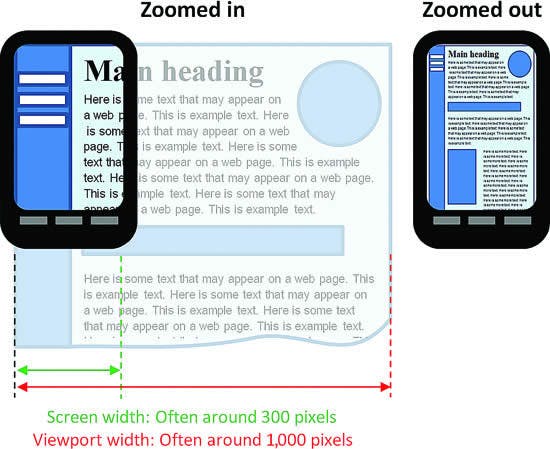
The browser's viewport is the visible area of the window in which web content is seen. The viewport varies according to the screen size of the device on which the website is visible. The <meta> viewport tag is the most effective way to improve how web pages look on smaller screens.
Viewport Meta Tag:
This is usually indicated in the HTML and these settings tell the browsers to display a website at the width of the screen of the device used and scale the content of the document to 100% of the intended size. That is, if the screen width is 320px, the browser window will take the same width.
         /* the meta tag is written like  */

  <meta charset="UTF-8"><meta name="viewport"          content="width=device-width, initial-scale=1.0">
The viewport meta tag is usually seen in the header of your HTML document and is written as:
<!DOCTYPE html>
<html>
    <head>
        <title>GeeksforGeeks</title>
        <meta charset="utf-8" name="viewport"
        content= "width=device-width, initial-scale=1.0">
    </head>
    <body>
    </body>
</html>
- Initial-scale: that sets the default zoom of a page in order to avoid pinching in or out to fit the content on the screen. To make sure the user doesn't need to zoom when visiting your page set this to a ratio of 1.
content="initial-scale=1"
 image source:stackoverflow.com/questions/33328451/viewpo..
Minimum-scale: sets the minimum zoom level.
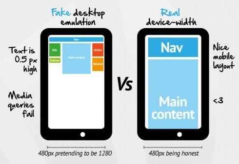
device-width: This sets the width of the page to follow the screen-width of the device on which it Is viewed.
content="width=device-width"
 image source: bizstreamacademy.com/ACADEMY/Class-Slides-2..
- Maximum-scale: sets the maximum zoom level. If you want to disable your user from scrolling at all you can setup a property maximum-scale to be 1 to make sure you can't scale anymore. Although maximum-scale is bad news for accessibility
content="maximum-scale=1"
User-scalable: it determines if the zooming can be enabled or disabled.
Height/ Width: Sets specified height and width for the viewport.
A web page that is not made responsible for smaller viewports appears terrible and unarranged on smaller screens.
Note:
Do not use a responsive meta tag if your website isn't specifically designed to be responsive and work well at that size, as it will worsen the user experience.
Also, It’s recommended that you don’t prevent scaling, as that’s annoying and can be potentially an accessibility problem.
Some additional rules to follow:
Do NOT use large fixed width elements - For example, if a video is set to a width wider than the viewport it can cause the viewport to scroll horizontally. Always remember to adjust the content to fit within the width of the viewport.
Do NOT let the content rely on a particular viewport width to render well - Content should not rely on a particular viewport width to render well since screen dimensions vary according to devices.
Use CSS media queries to determine screen sizes either small or bigger screens - Avoid setting the absolute width to CSS elements and consider using relative width values, such as width: 100% in other to achieve flexibility.
Conclusion
It is undeniable that mobile search surpassing desktop search, it’s a factor that cannot be ignored. One major factor in determining mobile friendliness is how well a page displays on different screen sizes for various mobile devices this is why we should always include the viewports meta tag when building a page.

