


Introduction
The flexbox module is a one dimensional layout which provides an efficient way to align, layout and distribute space among elements within your document even in a case of dynamic view point or size. Flexbox as a one dimensional layout refers to the fact that flexbox deals with layout in one dimension at a time either as a row or column. To begin using the flexbox model you must start by defining the flex container. Laying out is a simple list of items that takes a particular format. that is :
<div class="parent">
    <div class="child">
        <p>this is the descendant element </p>
    </div>
    <div class="child">
         <h5> also known as grand child element</h5>
    </div>
</div>
In the above example the div houses other items and that makes it a parent element , and the divs within this div are the called child elements.
- Flex container: is the parent element containing the child element. it is done by indicating the (Display: flex;) and this causes all elements to align themselves horizontally in an inline format. They immediately align horizontally from left to right and or vice-versa. The main axis and cross axis are the terms used instead of horizontal and vertical direction in the Flex when it comes to flexbox nodules. The main axis is from left to right while the cross axis is from bottom to top
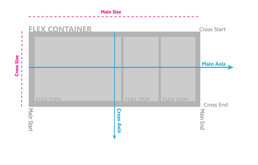
- Flex items: is the child element exiting within the parent element.
Properties of flex container
- Flex-direction
- Flex wrap
- Flex flow
- Justify content
- Align-items
- Align-content
Flex-direction
This property controls the direction in which the flex-items are laid along a main axis, either vertically, horizontally or reversed in both directions. This takes up 4 values:
- rows
- Column
- row-reverse
- Column-reverse.
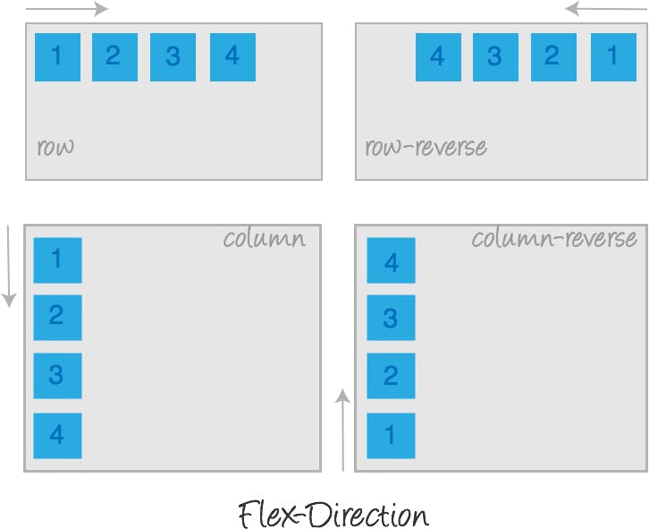
Image source:tympanus.net/codrops/css_reference/flexbox
Flex-wrap
The flex-wrap adapts to contain the new file items it determines whether the items that are aligned will break into the next line when the number of items are increase it would adjust to fit all items on single line It takes 3 values :
- Wrap: allows items to break into multiple lines when a single line can no longer contain list items in default width.
- Nowrap: the container adjusts the width of items to fit all items without breaking to the nextline. Wrap-reverse: this allows flex-items to break into multiple lines in a reverse direction
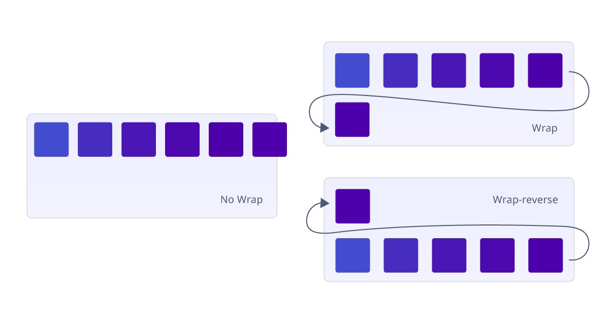 Image source:blogs.quovantis.com/understanding-the-css3-..
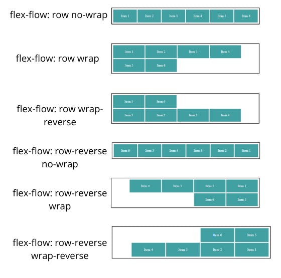
Flex-flow
This is a shorthand for flex-direction and flex-wrap, its values are a combination of both and can be seen as
- Row nowrap
- Row wrap
- Column wrap
- Column nowrap
Justify-content
This defines how flex items are laid out on the main axis. It takes 5 values;
- Flex-start : it is a default value for justify-content which places items towards the start of each flex line.
- Flex end : this places items at the end of the flex line.
- Center: places flex items in the center of the line.
- Space between: displays equal spacing between flex items.
- Space around: equal space around every item.
- Space evenly
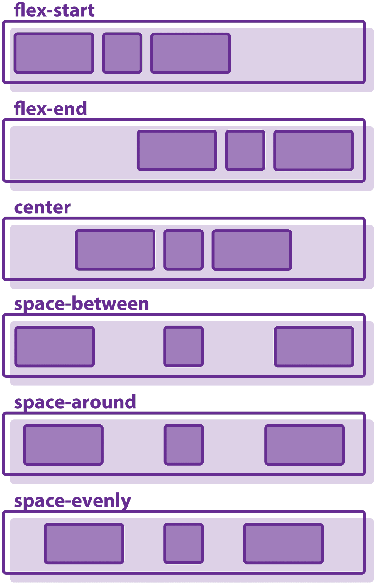
Image source:bitdegree.org/learn/css-flexbox
Align-items
This is very similar to justify-content and is known to have 5 values;
- Flex-start:this places items at the start cross axis maintaining the(flex-direction) writing mode rule.
- Flex-end: the items are placed at the end of the cross axis . It still maintains flex-direction rule .
- Center: items are centered in the cross axis.
- Stretch:this makes the items to stretch to fill the container while maintaining the default width
- Baseline:it aligns items to have their content seat on their baseline.
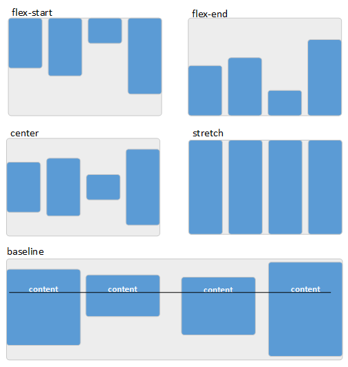
Image source:flexbox.tech-academy.co.uk/align-items-stre..
Align-content
This is used on multiple-line flex container. it controls how items are aligned in a multi-line flex container just the way the wrap property works. It has about 4 values:
- Stretch: items are stretched to fit the available space along the axis.
- Flex-start: it aligns all items in the multi-line container to start of the cross-axis . Makes the items to be aligned to the top of the flex container.
- Flex-end : value aligns the flex items to the end of the cross axis (ie. the button of the flex container).
- Center: items are centered in the flex container.
- Space-between : items become evenly distributed with space between them from top-bottom of the flex container.
- Space-around: items are evenly distributed with space around them.
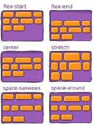
Image source:css-tricks.com/snippets/css/a-guide-to-flex..
Properties of Flex-items (Child element)
- Flex grow
- Flex shrink
- Flex basis
- Flex
- Align self
Flex grow
The flex grow defines the ability for a flex item to grow if necessary. It permits an item to take up the available space in the container depending on the value set. It determines how much an item will grow relative to the rest of the flex items in the same container.
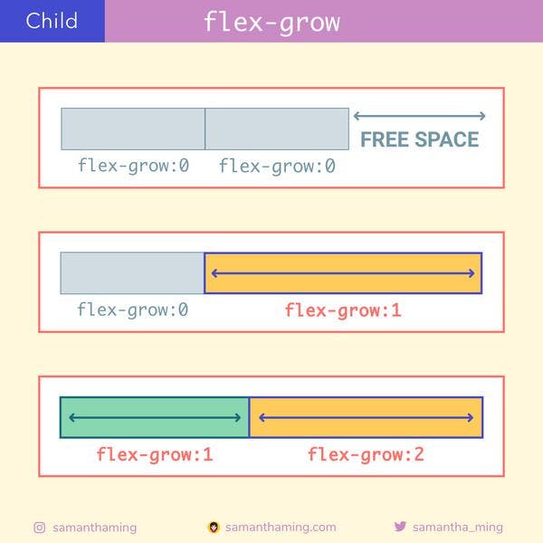
Image source:samanthaming.com/flexbox30/21-flex-grow
Flow shrink
Define the ability of a flex item to shrink if necessary after being assigned a set of value.
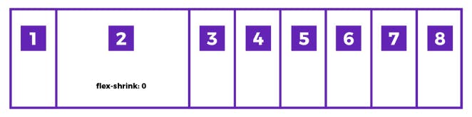
Image source:getflywheel.com/layout/flexbox-create-moder..
Flex basis
This defines the default size of an element before the remaining space can then be distributed It can be written with a keyword which means "look at my width or height property"(eg Auto) or a length(eg.20% 5rem) .
Flex
This is the shorthand of flex grow, flex grow and flex basis combined. It sets how a flex item will grow or shrink to fit the space available in a flex container. Example( it can be written as this )
.child{
    /* it has 3 values (flex-grow,shrink and basis) */
     flex: 2 2 10%;
   }
   .child{
     /* this is for the two values (grow and shrink) */
     flex: 2 2;
   }
Align self
The allows the default alignment to be overridden for individual flex items. It works just like the align-items.
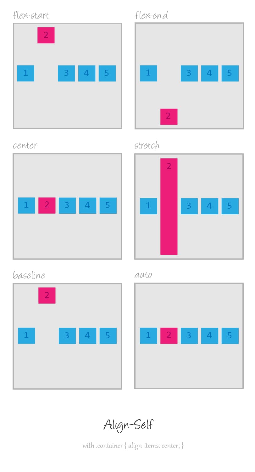
Image source:tympanus.net/codrops/css_reference/flexbox
NOTE: that the float, clear and vertical-align have no effect on flex items.
WHY SHOULD YOU USE THE FLEXBOX?
- It works well with responsiveness using order property.
- It simplifies complexity.
- Creating repeatable elements is quick and easy.
- You can manipulate inline elements easily with flexbox.
- It allows you to center elements.
- It is quite easy to understand
- It is supported by major browsers
- It works great when combined with media queries
Conclusion
The flexbox may have about 12 properties each with at least 4 potential values and grabbing all can be overwhelming but then, you don't have to start with all properties because the Display, justify-content and Align items serve a great deal.
Reference
CSS tricks:A Complete Guide to Flexbox
When to use flexbox;brolik.com/blog/when-to-use-flexbox/#:~:tex...
6 Reasons to Start Using Flexbox
Flexible box layout basic concepts: developer.mozilla.org/en-US/docs/Web/CSS/CS..
- Flexbox - The Ultimate CSS Flex Cheatsheet (with animated diagrams!)